One principle of design is Proportion and we use it almost daily, whether it is a painting, a photography or a interior design project, from arranging items on a shelve, up to setting your table when you promote your products to a craft’s market.
When we refer to this principle, we tackle actually proportion and scale, and here below are some ideas what they are and how you should use them in your composition (more details and art reference will be tackled in a separate module).
SCALE
Scale refers to the overall physical size of an artwork or objects in a composition, and each element needs to be in scale with the other elements.
Usually we relate scale to our body, how small or big is compared to us - therefore, the scale can be large (not being realistic, they tend to become dramatic) , small or contrasting ( it creates a tension, a dramatic effect, like a man next to a huge ship engine).
PROPORTION
Proportion describes the relationship between the dimensions of different elements, it is the size relationship between parts of a design.It considers the relationship between height, width and depth, or how the sizes relate to each other.
The purpose of using the size of the elements against each other is to draw attention to a focal point - to a particular area, to the main subject.
I will add here another idea, from my perspective, we need to consider proportions also for the chromatic side - the colours on those elements.
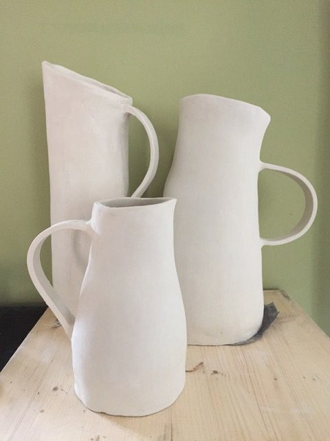
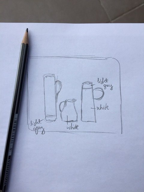
For example, I create my large ceramic jugs (or vases) and I try to have great "colour proportions" in a composition as well.
I have three unfinished pieces, so, I would consider in this case:
As you probably have observed in time, proportions can be realistic, altered or used for aesthetic purposes.
1. Realistic ones can are those who keep the “normal proportions” between elements (like if you draw a fish, the head would have the right proportion compared to the body).
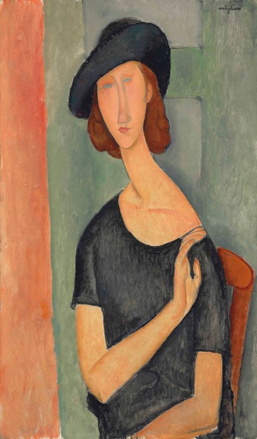
2. Altered proportion can make a statement and try to promote some special ideas, values. Consider for example Modigliani’s paintings - the elements of the body (neck, head) are stretched, and this way they look more elegant.
3. Aesthetic effects, such as the golden ratio or the rule of thirds (a simplified version) - can be used to draw the attention to a particular focal point.
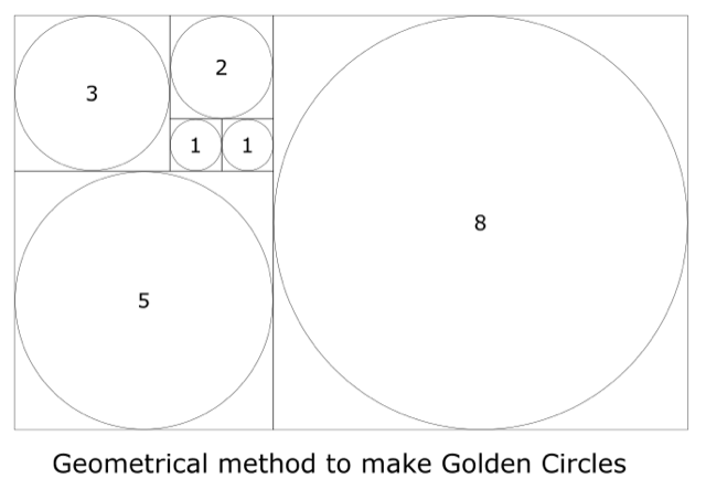
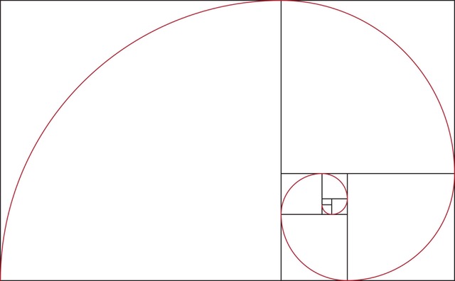
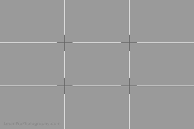
Golden ratio gives a sense of natural and calm, while rule of thirds splits an image into a grid with 4 focal points.
The lines can also separate the foreground from the background and the focal points draw the attention to those specific elements of your composition.
As a suggestion, don’t try to “fill” all of the 4 focal points in a composition, emphasize only 1-2 of these.
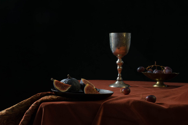
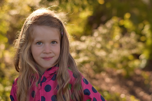
I had the chance to participate to a great still life photography workshop in UK some years ago and practice still life composition in photography.
I must recognize, it is quite challenging, and as in the example below, I arranged the props according to the lines of the grid, so that they are all in harmony.