Before jumping into this topic, make sure you visited 2.2. Elements: Colour
Branding is the experience a business will create around its purpose, no matter if products or services.
A brand indentity is made of the visual and voice elements that shape that experience.
These elements may include: colour palette, photography (imagery), logo, typos (fonts), music, print, themes, words, phrases and more.
You already wrote down about your brand fundamentals (see 3.3. and 3.4) - what your values and beliefs are, about yourself and your business.
Don’t jump directly into Pinterest search, review once more that outcome with an intention and make adjustments if needed.
In this way, you will set the fundamentals and find the clarity in defining and finding your style, a style that has a meaning for you, not just a pretty trend.
As mentioned before, visual branding will differentiate yourself from other creatives that sell the same or similar products or services.
Being a small business owner or defining your personal visual style, you have to remember that your personality will come through in your images - whether it is your lifestyle or your products or services.
When you pour parts of your personality, of your style into the visuals, you practically give people a sense of who you are. It helps them visualise how it can be working or hanging out with you or using your products or services. Through visuals and constant connection, they will feel and act as if they already know you.
This way, you allow them to connect with you and this is the first step in the sales process. Further on the way, this connection will build trust and only having the feeling of trust, the potential customer will buy from you.
Creating a cohesive and consistent brand will result in making your brand memorable and recognisable.
Being consistent means that your presence on all platforms will look uniform, this way it will breed credibility which further breeds trust.
In just a few words: Attract —> Connect —> Trust —> Sale.
This is why your style - both visual and voice - has to remain consistent through time, so that the viewer can identify you easily.
When you have a consistent visual style / brand, people know what to expect - from colours, props, the editing style of your images.
People will interact with your brand in different ways: your website, social media, printed materials, physical products or even in person.
COLOUR PALETTE
It is probably the most powerful tool in visual branding, because colours evoke emotions and actions and help set the overall aesthetic of a brand, they generate an emotional experience.
Though it looks as an easy process, it can become difficult to pull out a cohesive colour palette for your brand & just a piece of advice - remember to have fun and joy when finding “your colours”!
Emotions
In respect to emotions, the rule is that emotion trumps logic and an average of 80% of purchases are based on emotions backed up by logic.
This is why before jumping into colours, go back to your fundamentals previously defined & think of questions like these: do you want your viewers to get energized, excited or maybe create a feeling of understanding and calm…
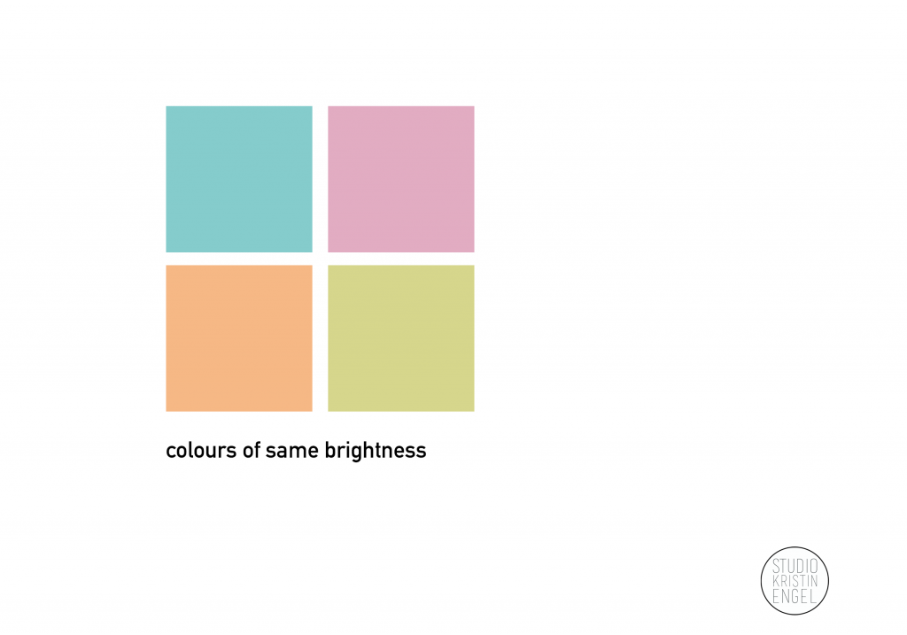
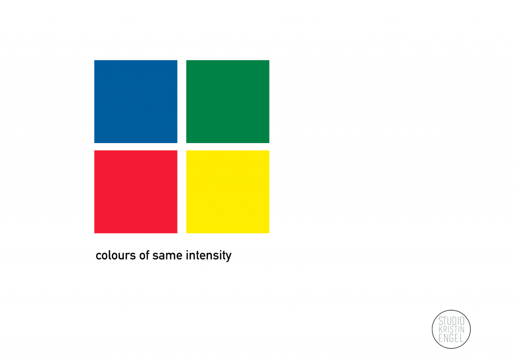
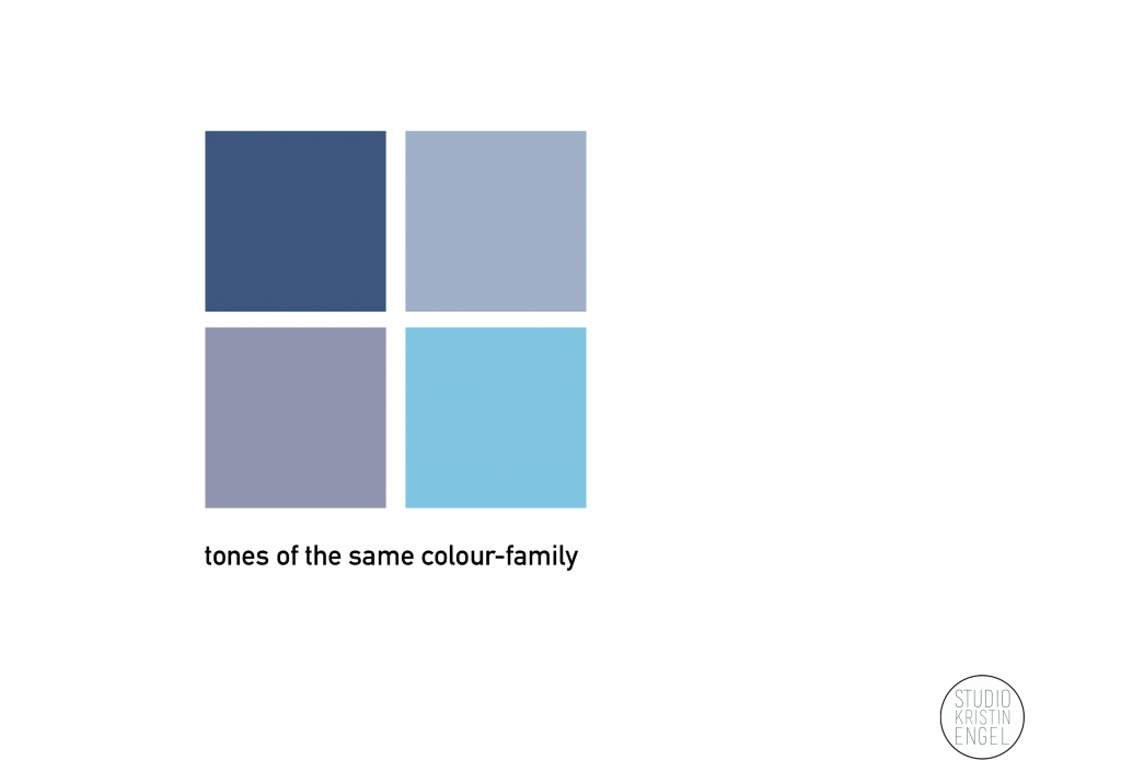
The intensity of the emotions can be translated into a colour palette by considering the brightness (pic 1), intensity (pic 2) and tones (pic 3):
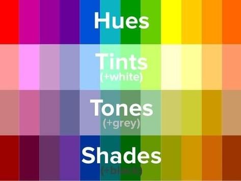
Overall terms used in relation with colours:
In relation to these, you can search for the emotional triggers of your colour within your colour palette.
Overall aesthetic
In defining the aesthetics of your brand, you can set up your colour palette using:
Pinterest boards
Having done the mindmap on your fundamentals and visualising / imagining the overall feel and emotion your brand will evoke, you can start searching for images on Pinterest.
You can try out the following steps:
You know you are done with this exercise when your pins recreate the experience of your brand.
This program will pull out the colours directly from your pins (if you are looking to create the colour palette this way).
Option 1 - You can follow the steps:
Option 2 - You can follow the steps:
Now the work is done and you have a pdf file with your new colour palette!