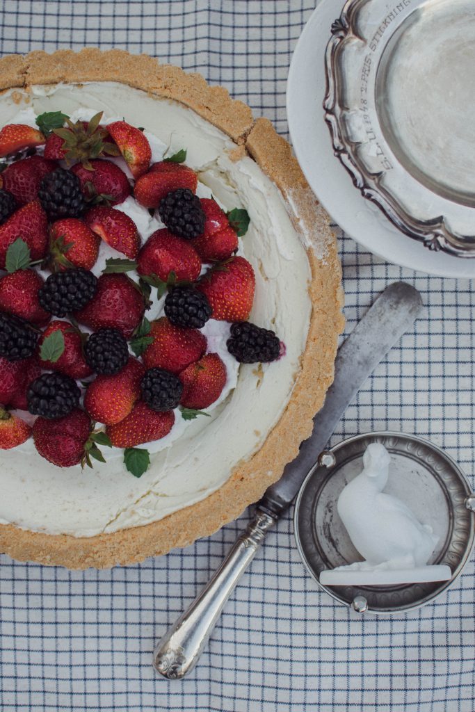
1. FLATLAY
A flatlay is a picture taken from above, like a perfect 90 degree angle _I .
Flatlay is the actually the brid’s eye technique used in painting.
You have a surface that serves as a backdrop where the elements of your composition are grouped.
You can have one element as you main subject / main focus , while the other will help you build the story around it.
The surrounding elements are props that help create a specific mood - think of food photography.
There is definetely a main subject (one element or a group) and the props around it to show the atmosphere:
You can arrange the items using:
- the rule of thirds method (see 2.2) .
You will have again the terms of positive space (taken by main subject and props) and negative space (the area between them)
- S shape - the eye will travel around the shape
* Remember to take pictures with lots of negative space (like placing only one element in a corner of your picture) when you want to allow room for text (tagline, description, selling details, etc).
Steps on the process:
1. think first what is the concept about, what is the theme of your flatlay
* try drawing on a paper the shape of the main subject and the main props
2. gather your props- arrange the items and see how they look overall as a whole composition, check proportions, balance
* flatlays indicate the idea of order and the human eye is attracted to this, this is why flatlays are very appealing
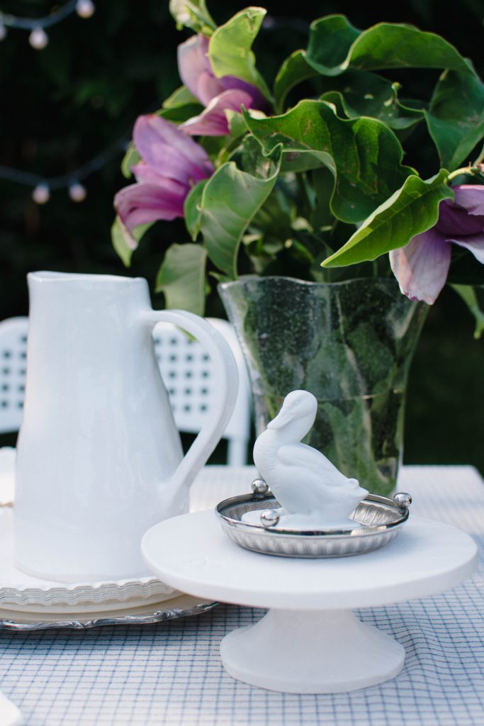
* even main props can be used atypical (like having a glass lay flat next to a cake) - there is no definite of rules, it is creativity
3. pick a wonderful backdrop to enhance the theme (you can use organic ones, printed, paper, vinyl, etc)
4. search the best soft natural light
- do the testing and shoot a few images, maybe rearranging some item
* you can cut off some of the items in the composition (as above), not all of them should appear in the picture
* when they overflow from the image, it creates an intrigue, engaging the viewer’s imagination
5. edit the image and think of the format of your picture for different social media: it is best that you start shooting in a square format and let some negative space (as height for a Pinterest image)
Grouping: the 3 items rule
It is best when you are working with groups of odd numbers, is also more appealing to the eye (like 3 glasses).
When styling your image, arrange your 3 items in a triangle.
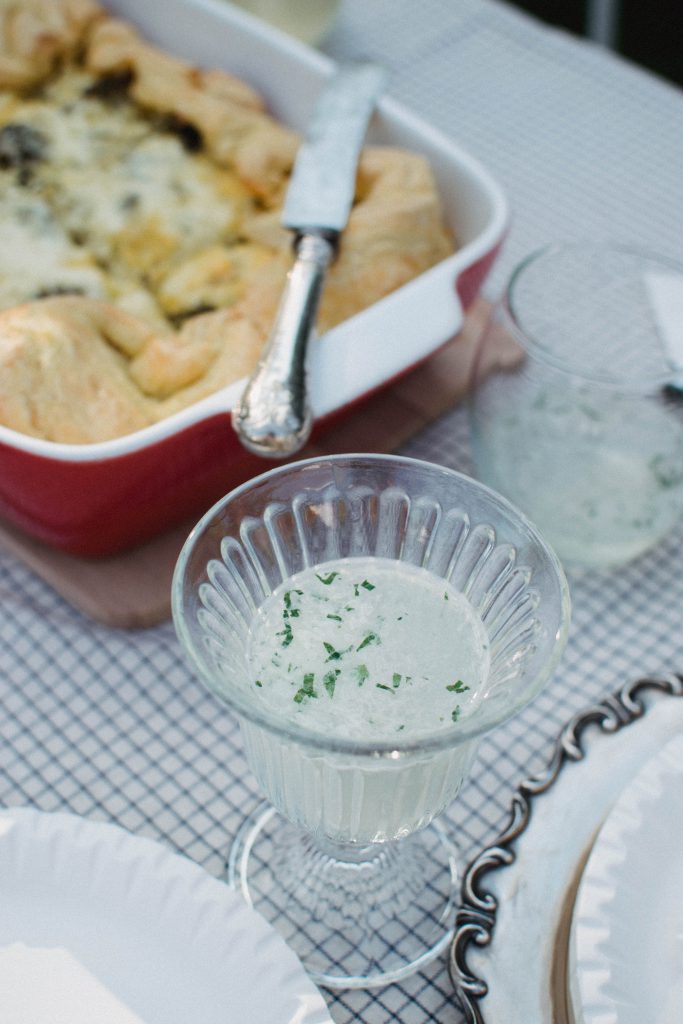
Create depth
For adding more depth to your image, you can work with layers - the best example comes again from food photography.
You can stack different sized plates, fabrics, stands in order to enhance the composition and to create the desired atmosphere.
Place your main subject on top of these layers.
2. VIGNETTES
Vignettes are pictures taken at a specific angle; the most common ones are:
- like looking to another person (parallel to the composition where objects are standing tall)
- 45 degrees - for small items:
The steps on the process:
- think first what is the concept about, what is the theme of your flatlay
- try drawing on a paper the shape of the main subject and the main props
- think of scale and of implied space (see space at 2.5 and proportion at 2.7)
- gather your props, they should send the same message
* consider the effect of overlapping and check your colour palette
- search ghe best soft natural light - consider also the “Rembrandt” light, specific on the main subject
Here are the recommended sizes for your images for FB, IG and Pinterest (summer 2020):
FB:
- profile photo: 180x180
- cover photo: 820x312
- shared image (newsfeed, timeline): 1200x630
- event image: 1920x1080
IG:
- profile photo: 110x110
- photo thumbnails: 161x161
- photo size: 1080x1080
- photo stories: 1080x1920
Pinterest:
- profile photo: 165x165
- photo size: 2:3 ratio - can be 600x900, 100x1500, 1200x1800