The way we create a composition using colours, to evoke a specific emotion, is influenced by:- relationship between colours (primary, secondary, tertiary) - similar, contrasting, harmonious- temperature - warm or cool- intensity or strength - original hues, lighter tints, darker shades
Overall terms used in relation with colours:
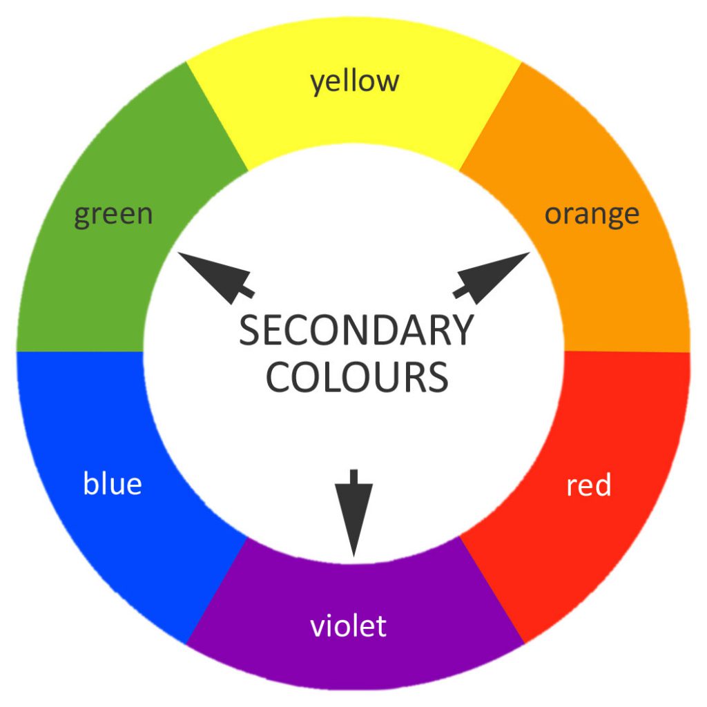
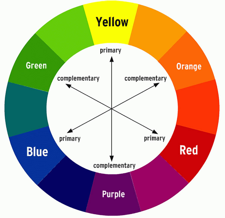
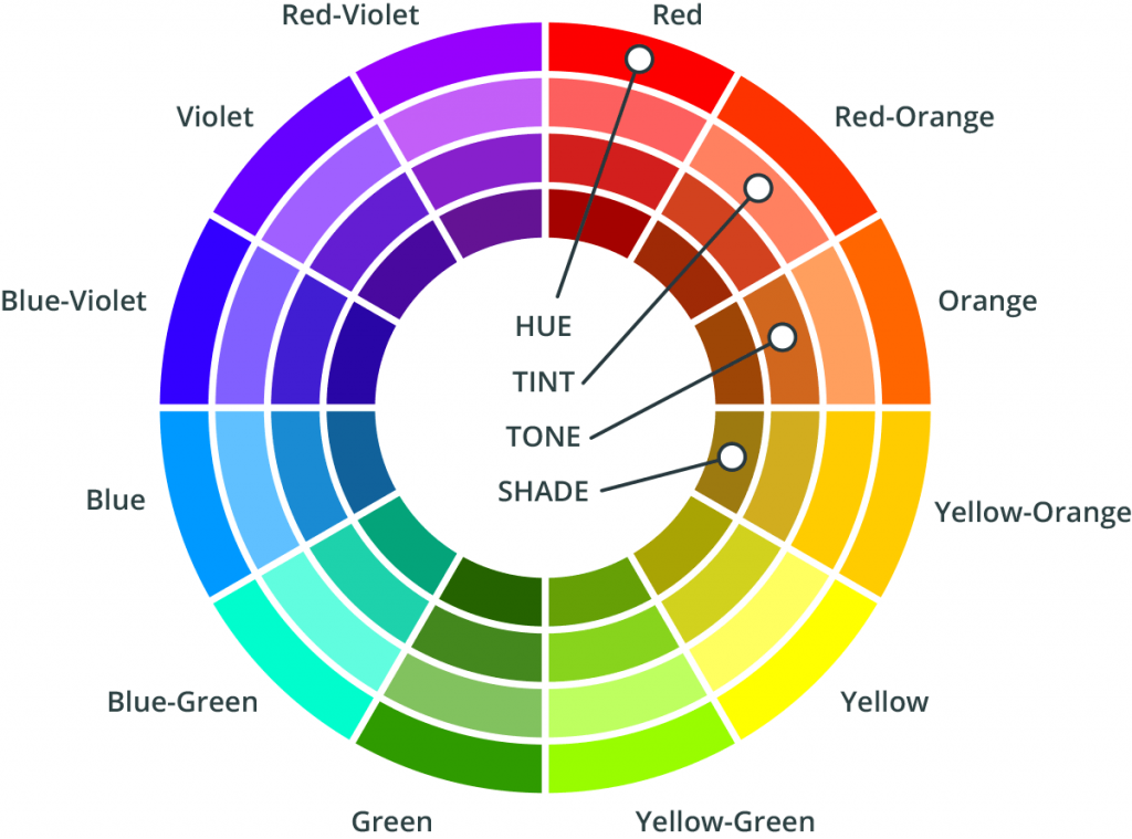
The colour wheel shows us the relationship between colours: Pic 1-pic 4

Warm colours remind us of things associated with the concept of heat such as summer, sun, fire, while cool colours remind us of things associated with the absence of heat – such as winter, ice, water.
Warm colours are said to advance towards you as if they are jumping out of the painting. These colours are energetic and will catch the viewer’s attention by drawing their eye towards them. Cool colours recede into the background, as they would move away from the viewer; they can be calming and relaxing, but can also suggest sadness.
Warm and cool colours can be used together to create contrast or a sense of drama, to add interest or to balance the temperature of a composition.
When you place complementary colours next to each other, you create a very strong contrast and the colours appear more vivid and brighter.
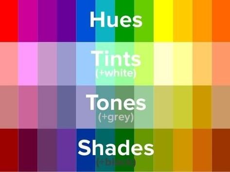
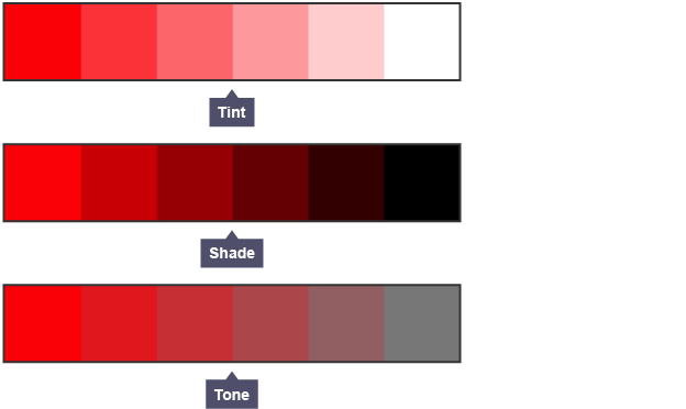
You can create a monochromatic composition by using tints, shades and tones of a single colour.
------------------------------------------------------------------------------------------------------------------------------------------------------------------------------------------------------------------------------------------------------
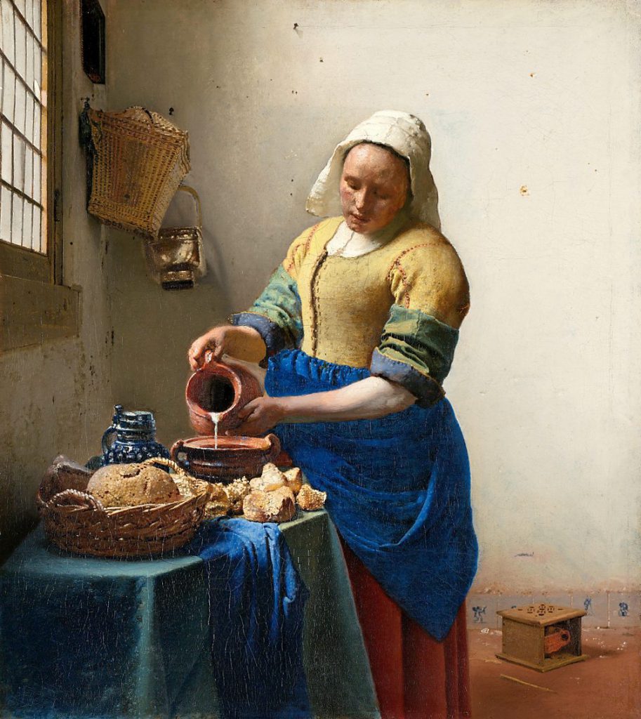
Jan Vermeer used tints, shades and tones of primary colours, and it created a relaxing colour palette for the viewer:
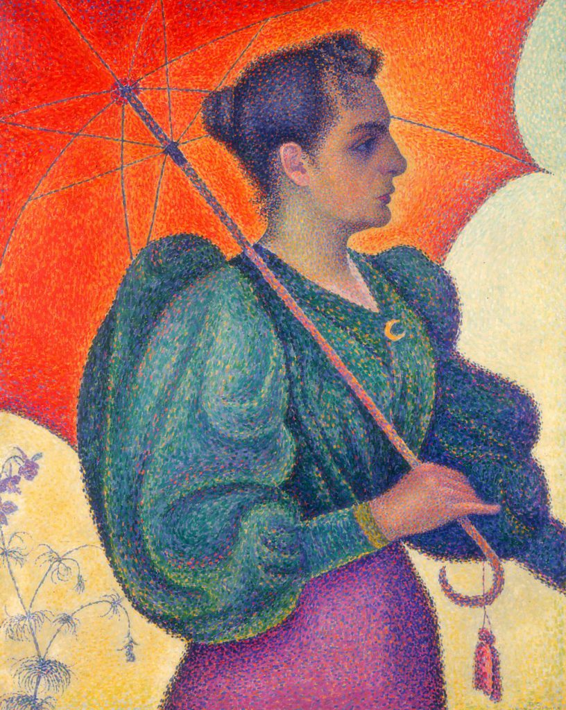
----------------------------------------------------------------------------------------------------------------------------------------------------------------------------------------------------------------------------------------------------- Paul Signac creates a vibrant image using tertiary colours:
------------------------------------------------------------------------------------------------------------------------------------------------------------------------------------------------------------------------------------------------------
Pablo Picasso used the yellow to create warmth and it suggests the guitar is a reconforting elements in the life of that man:
--------------------------------------------------------------------------------------------------------------------------------------------------------------------------------------------------------------------------------------------------------
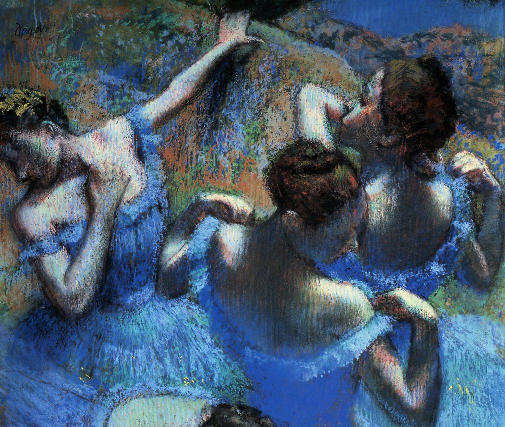
Edgar Degas used a harmonious colour scheme (three to five colours that are beside each other on the colour wheel) with blue and green to create a calming atmosphere:
------------------------------------------------------------------------------------------------------------------------------------------------------------------------------------------------------------------------------------------------------------
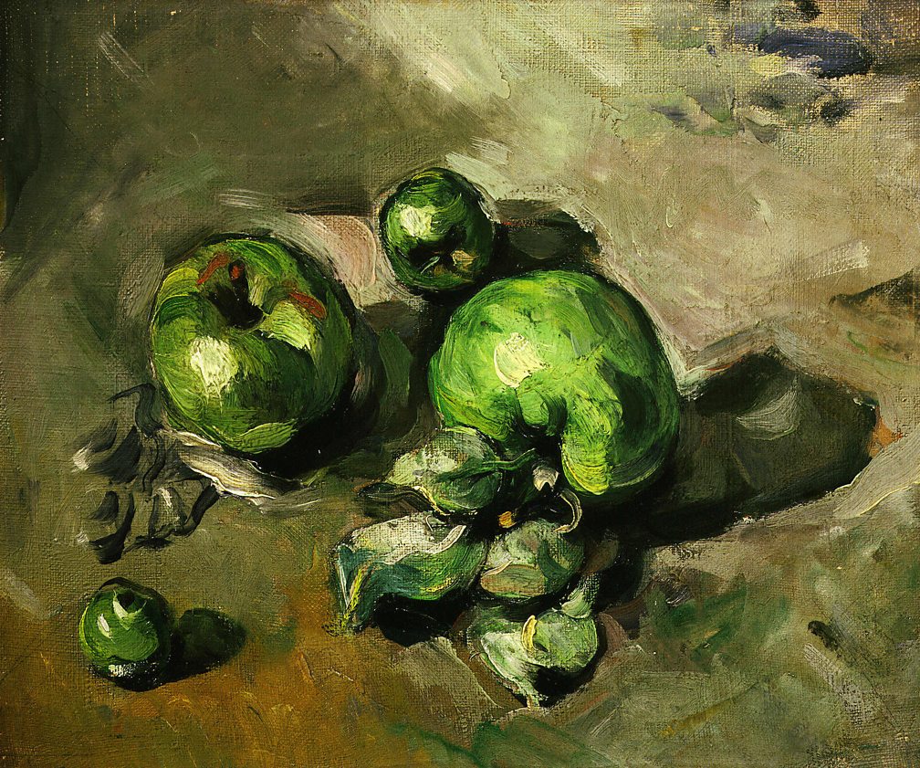
Paul Cezanne created an artwork which is almost monochromatic, using various greens:
---------------------------------------------------------------------------------------------------------------------------------------------------------------------------------------------------------------------------------------------------------
Colours will help you create a mood, an atmosphere or evoke an emotion. This will be impacted by the meaning associated in a cultural or social way with that specific colour.For example red can be used asa an energetic suggestion, for call-to-action buttons, or the association with love and passion in western culture, while in other is the sign of death.
Here is a general listing of the meanign associated with colours:
When creating the colour palette for your website or for your resources (freebies, layouts, etc), you should carefully address the meanings of colours in connection with the area you are living in, the purposes of creating those resources and not ultimately, your photography.
You can find also ideas on branding and the colour palette in topic 3.5.
We are all aware of the general classifications of “airy/light”, “moody/cool”, “vivid/oversaturated” in photography - creating your unique and consistent style is so important so that you become recognizable and remembarable in your audience’s mind!